We’ll walk you through a real-world example of monitoring OpenAI APIs in production to show you what this looks like in action.
In practice: Create a dashboard monitoring OpenAI LLM APIs
Imagine you’re on a platform team at a SaaS company that recently integrated OpenAI to power features like smart search, summarization, or chatbots. With these capabilities now live, your next challenge is ensuring they perform reliably, scale efficiently, and stay within budget. This is where Dynatrace shines—helping you transform telemetry into insights that drive action.
Let’s walk through all the steps to create just such a dashboard, and dig deeper to:
- Find and add (OpenAI telemetry) data with ease.
- Tailor visualizations to understand token usage, latency, and error metrics easily.
- See what matters: filter and segment data by LLM model, service, or environment.
- Predict and prevent issues: avoid model response slowdowns and cost spikes.
Find and add (OpenAI telemetry) data with ease
Creating a new dashboard begins with identifying and understanding the relevant data for your use case. Monitoring LLM APIs requires the visualization of key metrics like request volume, latency, or error rates per model. With Dashboards, exploring your data is intuitive, providing multiple ways to search for and analyze data.
- Start with a ready-made dashboard that provides instant insights.
- Explore data using a simple-to-use point-and-click interface—ideal for getting started by quickly adding tiles.
- Utilize the full power of Grail by writing your own DQL query or utilizing Davis CoPilot® to transform your natural language prompts into DQL queries.
As an experienced Dynatrace user, you’re familiar with exploring data in context with our purpose-built apps like Kubernetes, Logs, or Distributed Traces, and how to add visualizations from those apps to your dashboards.
Let’s look at some of these approaches in the following sections.
Start the journey with ready-made dashboards
You don’t have to start from scratch. Dynatrace offers many ready-made dashboards as part of Dynatrace® Apps and purpose-built extensions to serve dedicated use cases. As the leading observability solution for monitoring AI workloads, we offer dashboards for all major AI and LLM stacks, including agentic frameworks such as OpenAI, Anthropic, Amazon Bedrock, or NVIDIA. These dashboards provide instant value, whether you’re monitoring performance or debugging expensive prompts. By delivering real-time insights into request volume, latency, cost, and service health, they not only save you time but also create a solid foundation for tailoring their experience to your needs.
Let’s start our journey by opening the ready-made dashboard for OpenAI and creating a copy of it. To follow along, locate the Dashboards app on the Dynatrace Playground.
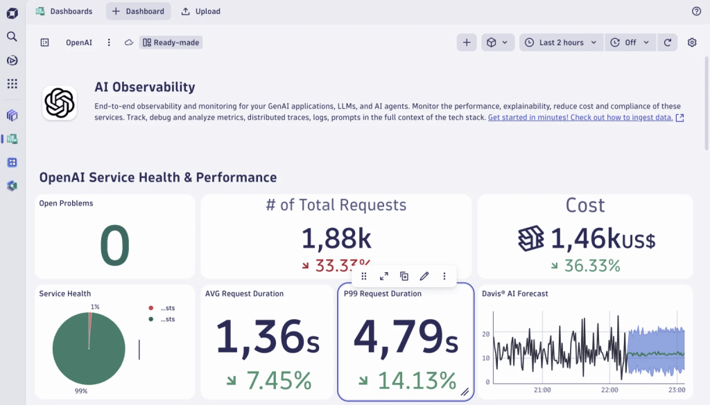
Figure 1. Duplicate the ready-made dashboard to customize it.
Dynatrace
Add further tiles to analyze token usage
Next, let’s add another tile to visualize the overall prompt token usage by type: input vs. output for OpenAI services. From discussions with our platform observability team, we know that all relevant metrics sent to Dynatrace using OpenTelemetry are available as custom metrics prefixed with gen_ai. We add a metrics tile and type gen_ai into the search field. This instantly surfaces all related telemetry. A few clicks later, applying data splits and aggregations, we have two more tiles, demonstrating how simple it is to turn raw telemetry into actionable insights:
- A pie chart that shows the balance between input and output tokens
- A line chart that tracks how the usage evolves over time
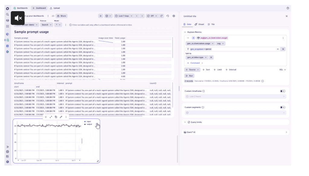
Figure 2. Visualizing overall prompt token usage.
Dynatrace
For further insights into the exploration and transformation possibilities in Dashboards, check out our blog post on transforming data into insights.
Leverage the power of Dynatrace Grail
Not sure where to start, which metric to use, or how to quickly advance with the power of Dynatrace Query Language (DQL) and Grail® data lakehouse? That’s where Davis CoPilot® comes in. Built directly into Dashboards and Notebooks, Davis CoPilot allows you to interact with your data using plain language—no need to write queries or know exact metric names. Just type something like Visualize token usage by input and output types, and the AI will help you instantly generate the appropriate query, taking you from question to insight in seconds.
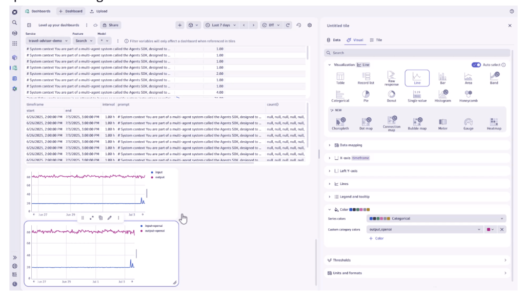
Figure 3. Use Davis CoPilot to create and visualize queries instantly.
Dynatrace
Tailor visualizations to easily understand token usage, latency, and errors
As someone responsible for monitoring systems or ensuring service reliability, you know how important it is to get the right insights at a glance. Dynatrace helps you build intuitive dashboards that focus on what matters most: understanding your data and taking action on it.
Once the data is set and a tile added, Dynatrace automatically suggests the most suitable visualization. For example, when tracking API token usage by type over time, a line chart is recommended to highlight trends and fluctuations.
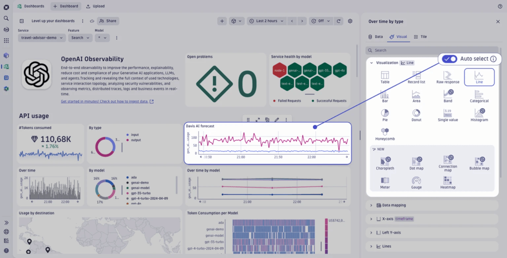
Figure 4. A suitable line chart visualization is automatically suggested.
Dynatrace
Dynatrace also applies other smart defaults based on the context of the visualized data. For example, when you add a metric that tracks the usage of example prompts and split it by the prompt name, sparklines are automatically included to show trends over time—no extra configuration needed. And if you’re already a power user, the newly added search speeds up your dashboard creation journey by offering a way to instantly jump to any configuration without the need to scroll around. But there’s a lot more that helps improve the user journey. We harmonized the settings of individual visualization types, ensuring that already defined configurations, such as color palettes or units, persist, even if you change the type.
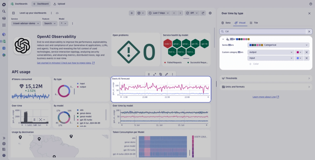
Figure 5. The settings of individual visualization types are enhanced and harmonized.
Dynatrace
We’ve also made many updates to the chart plotting features of our pre-existing visualizations. For example, the single value tile, which used to be a basic number display, is now a highly expressive component. You can now enrich the single value tile with icons, apply color thresholds to flag anomalies, add sparklines to show trends, and add value and trend labels that provide additional context for the charted value and give it meaning.
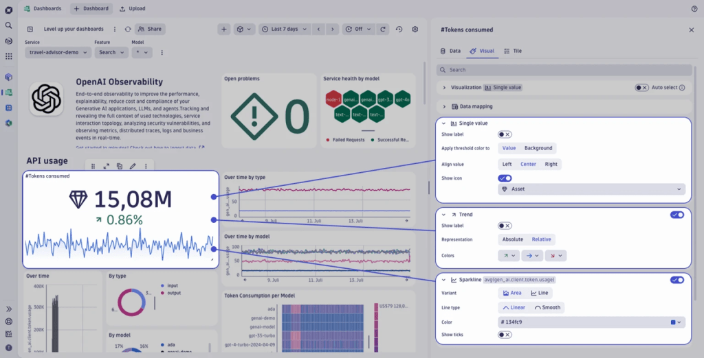
Figure 6. The single value tile now also includes sparklines and other options.
Dynatrace
Plotting the values on a map benefits many signals. Consider displaying token usage or prompts issued per destination. The map component has a rich set of customization options—such as color rules, pin shapes, and unit formatting—explicitly designed to support the visualization of geographic data.
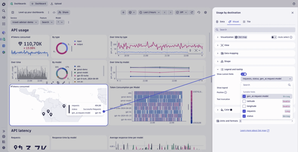
Figure 7. Use the map visualization to display data geographically and to uncover location-based patterns.
Dynatrace
See what matters: filter and segment data by LLM model, service, or environment
To make a dashboard truly actionable, the next step is to add filters and segmentations. This allows you to tailor one view dynamically for different audiences, environments, or services, all within a single dashboard. For example, you might filter an OpenAI dashboard by environment (production, staging, test) or model type (GPT-4.1, o3, o3-mini) to focus on what matters most in each context.
Dynatrace offers powerful ways to filter data:
- Using reusable segments, multidimensional global filters can be applied to all tiles and data. This is ideal for applying a specific (user) context, such as environment, team, or cluster. Segments are persisted across navigation between apps, allowing for simple drill-down journeys.
- With variables, we introduce Dashboard-specific filters, offering fine-grained control for each tile, perfect for filtering information such as LLM model type or feature toggles.
If you want a more in-depth tutorial, check out our latest blog post on filtering.
Predict and prevent issues: avoid model response slowdowns and cost spikes
Dashboards aren’t meant to be stared at all day. In most organizations, they’re often left untouched until something goes wrong. That’s when dashboards become invaluable: surfacing the correct data at the right time to help teams quickly understand, diagnose, and resolve issues.
From passive observation to proactive action, Dynatrace bridges the gap with interactive, AI-powered dashboards that don’t just visualize data; they empower you to act on it. You can add alerts and forecasts directly from charts with just a few clicks.
For example, suppose your dashboard tracks OpenAI model response times and associated costs. In this case, you can set an alert to notify your team if the average response time exceeds a certain threshold for a defined period directly from within the chart. This ensures you’re reacting to issues and anticipating them before users are impacted.
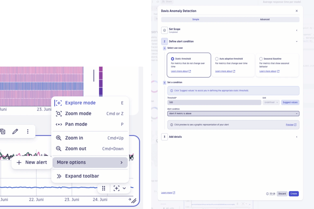
Figure 8. You can interact with your data directly on your charts, for example, zoom in/out and set up instant alerts.
Dynatrace
Another popular example of proactive monitoring is cost forecasting. Our dashboard already tracks cost trends over time—such as “prompt costs” and “complete costs,” for example—with a line chart highlighting weekly fluctuations.
By enabling forecasting, Dynatrace projects future spending based on historical usage patterns. This helps you anticipate budget overruns, adjust resource allocation, and make informed decisions before costs spiral. The predicted budget spend is shown alongside a table highlighting the “Top 10 expensive prompts.” This allows teams to identify which workloads or user actions contribute most to spending, ideal for optimization efforts or chargeback models.
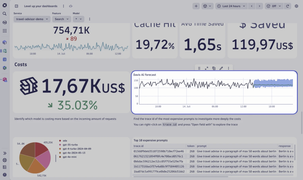
Figure 9. Utilize AI-powered forecasting to predict future costs.
Dynatrace
Share with teams: secure, flexible collaboration
The next step is to share our dashboard with the right people, ensuring teams are aligned across job roles and departmental boundaries. The new Dynatrace Dashboards supports flexible sharing options for collaboration within your organization.
Fine-grained collaboration settings allow you to:
- Share a document with specific users or groups applying either view or edit permissions.
- Roll out a dashboard to users in the environment.
- Generate a link that works for any authenticated user in your environment—ideal for broad internal visibility without managing individual access.
Ready to try it out yourself?
Dynatrace Dashboards redefine how teams interact with observability data. Whether you’re monitoring LLM APIs, optimizing cloud costs, or ensuring service reliability, Dashboards empowers you to:
- Explore data intuitively.
- Visualize insights using smart defaults and rich customization options.
- Segment and filter your data dynamically, offering tailored views for use cases.
- Act proactively on data anomalies using forecasting and creating alerts in context.
Experience the power of Dashboards: Head over to the Dynatrace Playground and browse the ready-made dashboards or create your own, following the steps described in this blog post.
Read More from This Article: From data to insights with Dynatrace Dashboards
Source: News